
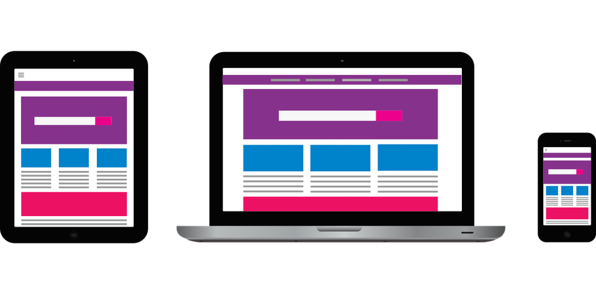
There are many different types of web layout designs that are available today, making it a difficult decision when it comes to selecting the one that is right for you. It has become a burning question in the minds of many; do I choose fixed, fluid or elastic web layout design? We get many questions regarding which type of web design we will use for client websites here at MLK Marketing, so we thought it was time to break down the matter and explain the pros and cons of each type of layout.
The main focus when it comes to selecting which web design layout can cater the best to your specific needs is usability. To ensure that your web layout is user friendly for each individual in your target audience, it is very important to consider a lot of factors that account for the potential variability amongst your website visitors. Some factors are the browser they are using, screen resolution, whether they maximise their browser, operating systems and other toolbars that remain open in the browser such as bookmarks.
Each web design layout can be a successful one that can maximise benefits to your business, as long as there is a logical final setup and usability is the main focus. Let’s take a closer look at the good (and not so good) parts about fixed, fluid and elastic website layouts.
FIXED WEB DESIGN LAYOUTS
For good measure, we thought we would start out with explaining what a fixed web design layout actually is. A fixed web design layout is basically one with a fixed wrapper width (as the name may already suggest. The thing about fixed website layouts is that the whatever is on the page either also has fixed widths or widths to a certain percentage. It is important to note that in a fixed website layout, the wrapper (otherwise known as the container) is designed not to move. What does that mean for the target audience?
Basically, irrespective of the user’s screen resolution, the same width will be presented to all website visitors. So now you may be thinking, why would a web designer use a fixed web layout? One of the main reasons is that with a fixed layout design, they are easier to construct and ensure the designer that whatever the layout may be when it is fixed, the visitor will also see the same thing. In other words, no nasty surprises!
Fixed website layout designs are perfect for designers who place many different design elements and incorporate them into the website. Also, for portfolio websites, fixed web design layouts are a popular choice as it is great for simple showcasing. But much like everything else we encounter, there are positives and negatives when it comes to fixed website layouts.
PROS:
-
Consistent widths across all browsers, meaning there are less issues that arise with embedded videos, pictures, contact forms and any other components to the website that are fixed when it comes to their width. See Elite Shower Repairs.
-
Fixed web page designs are significantly easier to use and prove little to no difficulty when you feel like giving your website a slight (or major) facelift from time to time. Basically, it is a hassle-free layout that does not turn a fun transformation into a Hollywood horror.
-
Because the widths are fixed, the need to set minimum or maximum widths are completely eliminated (phew!) Also, it is important remember that this is an advantage because not all browsers support this function anyway.
-
If a website is configured to be compatible with an 800×600 screen resolution, which is the smallest resolution, everything on your website will still be easily viewable at larger resolutions. Not having to squint is always a plus!
CONS:
-
Fixed website layout designs, in general, have a lower score when it comes to usability. This is an important factor to consider as the main goal and focus of selecting the right website layout for you is to provide high levels of usability.
-
For smaller screen resolutions, a horizontal scroll bar may be necessary to implement to your website. However, this is dependant on the width of the fixed layout.
-
Hassles may arise when it comes to needing to find seamless patterns, pictures and textures for your website. This is necessary in order to ensure you are also accommodating for the portion of your target audience who have large screen resolutions. Remember, increased usability is our aim.
-
Following on for users with a larger screen resolution, fixed design layouts may cause large sections of white space. This means that proportions and balance of the website can be compromised, leaving the website looking messy and thus lowering usability.
FLUID WEB DESIGN LAYOUTS
Fluid web design layouts, otherwise known as liquid web design layouts, have percentage widths (as opposed to fixed widths) for most of the components inside. Because of this function, fluid web design layouts therefore enable the website to adjust to the respective screen resolution of the visitor. Although designers may opt to used fixed percentages for certain elements such as borders and margins, the availability of percentage widths is a great way to increase usability due to its adaptation to different screen resolutions.
Fluid web design layouts are great for websites who attract large volumes of traffic, and for those who prefer a clean and simple website for their visitors. Before considering using this type of web design layout, let’s weigh up the pros and cons to ensure you make an informed decision to reap maximum benefits.
PROS:
-
You have the opportunity to completely eliminate the addition of a horizontal scroll bar for those with a smaller screen resolution. This can also make your website look much sleeker and sophisticated which brings forth the professional image of your business.
-
Increased usability, which means the visitor has an enhanced experience on your website due to adjusting to the user’s screen and set up. Say goodbye to websites that refuse to comply to your screen!
-
White space that occurs on fluid web design layouts is actually consistently similar across all screen resolutions and browsers. This gives your website a more uniform appearance as well as making it look visually striking across any platform.
CONS:
-
Unlike fixed design layouts, the designer has less control over what the visitor sees compared to what the designer sees. What does this mean? Basically the designer is unsure of how it will look across different screen resolutions even if it looks great on their actual resolution.
-
When it comes to very large screen resolutions, the consistency of the white spaces across all platforms may be broken. This can make the otherwise visually appealing website turn into a website with a lot of space and the give the illusion that not much content is actually present.
-
Pictures, videos and other means of content that have widths that are set may need to be configured and set up with multiple different widths in order to cater to those with different screen resolutions. Adaptability comes with a price!
ELASTIC WEB DESIGN LAYOUTS
A third alternative when it comes to selecting which web design layout is the elastic web design layout. This form of website layout is sometimes preferred more by designers as it is a unique mixture of fixed and fluid web design layouts. One of the favourable options that elastic website design layout brings forth is that all elements on the page are sized by em’s.
An em is a relative unit which responds to the size of text preferred by the user. This is a great way to increase usability. As elastic website design layouts are a fusion of fluid and fixed layouts, this provides a lot of benefits to both designers and users, however, there are still some upsides and downsides that need to be carefully considered.
PROS:
-
If set up and configured correctly and to a high standard, elastic layouts are extremely user friendly, which means it has a higher score when it comes to rating the usability. This is the case as all components on the website are resized to suit the preference of the user thanks to the usage of em.
-
Elastic website layout designs are the perfect combination of fixed and fluid layouts, meaning that designers can get the most offered out of both of the designs and incorporate them into an adaptive and user friendly website.
CONS:
-
Even though elastic website design layouts can be great for usability and ensure that the website is adaptive to preference, it can also cause great issues if you have not configured it properly. It takes a lot of experience and testing to make sure that the layout is actually responding to preferences for all users.
-
If you are a new designer, this may prove to be an extremely difficult project given you do not have the necessary expertise in completing such a layout. The time, energy and effort needed to create the extra bit of adaptive usability may not seem like it is worth it.
-
Some layouts when it comes to elastic design may require supplementary or extra cheats and style sheets for some browsers. This is dependant of the specifics of the layout design.


